2 The Inroduction
2.1 The essence of maps
Creating map is a useful way to take space into account in your research. The common ways to explain why to do so are Tobler’s laws of geography:
- Everything is related to everything else, but near things are more related than distant things
- The phenomenon external to an area of interest affects what goes on inside — Waldo Tobler
In fact, you shall not interpret these as strict laws of any kind. However it is very useful to treat these statements as initial hypotheses for spatial data analysis. In order to check whether any spatial pattern is or is not presented in a phenomenon, you can apply different techniques. Exploratory data analysis can be performed with spatial data, displaying a map is a way to visually evaluate quantitative features of spatial distribution, spatial statistics is a set of techniques to estimate qualitative features of spatial distribution. And our course follows this order to undercover you exciting world of spatial data analysis.
- First lesson is a brief introduction to a domain
- In the second lesson we will talk about creating plots with spatial data and GeoDa
- The third is about creation of simple thematic maps with GeoDa
- The last three lessons are about spatial statistics applications
Keeping in mind Tobler’s laws it is useful to understand two essential components of any map:
- Geographic space;
- Feature space.
Map depict things in spatially ordered way and the order is inherited from the real geographic space. This technique helps us to visually evaluate spatial relationship of objects, for example:
- How far objects are located from each other;
- How do the sizes of objects compare;
- What is the hierarchy of objects (e.g. one is located inside another);
- How are objects connected (e.g. they share some part of border).
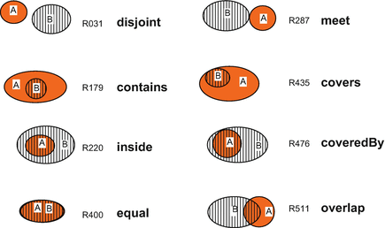
Figure 2.1: How objects can be related to each other in a map
The common approach to depict how the objects differ from each other is assignment some graphical variables (e.g. color, size) to properties describing objects. Cartography uses this familiar basis for emphasizing the substantial features of objects. Combination of graphical variable with geometrical shape gives us a description of where is the object and what is the value of some opbject’s property.
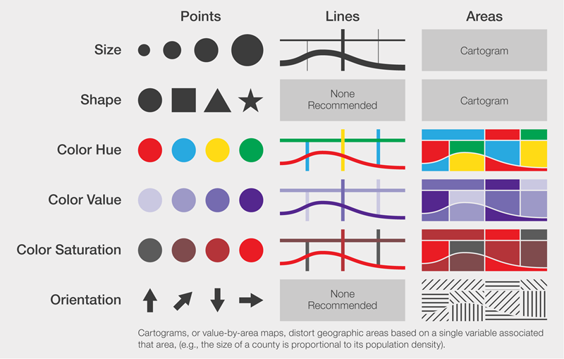
Figure 2.2: Simple geometry types and graphic variables: building blocks of map symbols
2.2 The necessity of maps
Now let’s see how map creation with GeoDa can help us analyze distributions of some census variables through Oaxaca state (Mexico) using Oaxaca development dataset. We will analyze the population of African descent and male/female population rate. The distribution of race or ethnicity often follows some spatial patterns in regional scale that demonstrate social and historical characteristics of an area. Evaluating of such patterns is a clear illustration of spatial analysis applications. On the contrary, human sex rate is more likely to appear roughly similar in scale of single state.
Taking a look at histograms, we can notice the huge difference in the distribution of variables. The distribution of human sex ratio is close to Gaussian distribution, whereas the distribution of African descent is bimodal. We can see a major peak with less than 13.7% population and a minor peak with more than 82%. There is a huge temptation to conclude that most of municipalities are roughly the same in terms of race distribution. However the minor peak in distribution suggests that we need to recheck our conclusions.
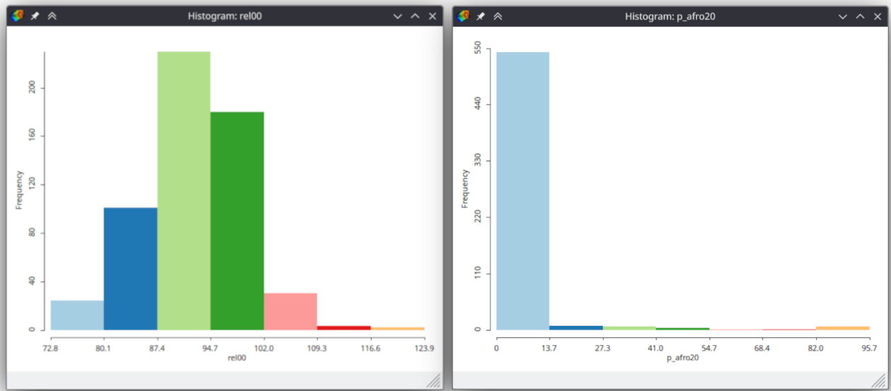
Figure 2.3: Human sex rate (right image) and population of African descent (left image) in Oaxaca municipalities, Mexico
Creating thematic map is a side view that we need here. The combination of municipalities’ position and variable value in a single image instantly shows us a compact region with high percentage of population of African descent.
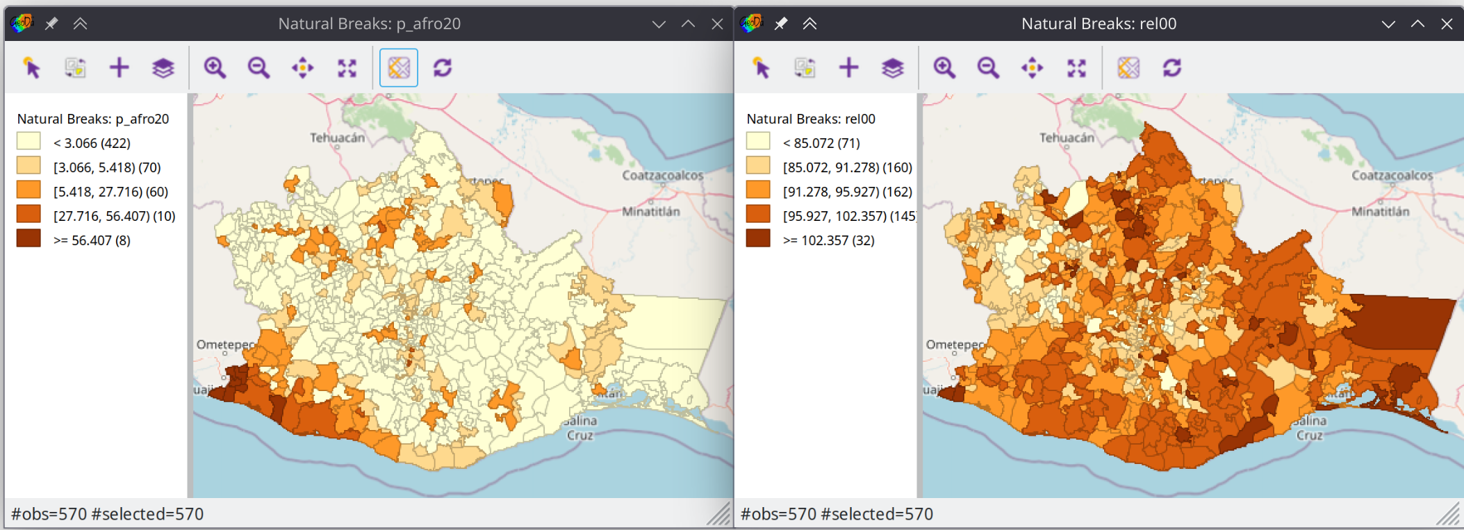
Figure 2.4: Population of African descent(left image) and human sex rate (right image) in Oaxaca municipalities, Mexico
The beauty of GeoDa is its capabilities for joint analysis of different types of visualization. Now we can make sure that minor peak in histogram corresponds to located region by selecting histogram bins. GeoDa will automatically highlight municipalities that share values with selected bins.
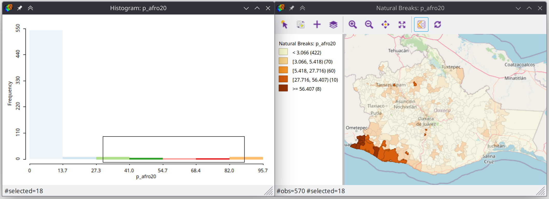
Figure 2.5: Population of African descent in selected municipalities
In order to numerically evaluate the particularities of spatial distribution we can apply spatial statistics techniques to our spatial data. By analyzing maps we can visually distinguish types of distributions of different variables. We have already noticed that municipalities with high proportion of population of African descent form compact regions. This is an illustration of Tobler’s law – municipalities that share similar values are close to each other. However, the distribution of human sex rate doesn’t appear to form such pattern. Human sex ratio looks independent from spatial relationships of municipalities. Geostatistical way to evaluate spatial dependencies is spatial autocorrelation analysis. We will discuss this concept further in lessons 5 and 6. For now it is important to notice how Moran’s index and spatial correlogram — the method of spatial autocorrelation estimation — correspond to thematic maps. We can see significantly higher value of Moran’s index (0.7 vs 0.3) for percentage of population of African descent.
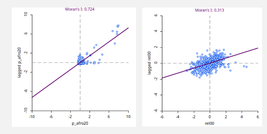
Figure 2.6: Moran index of population of African descent (left image) and human sex rate (right image)
2.3 Conclusion
In this lesson, we learned about the essence of spatial data analysis. We made a way from setting an initial hypothesis about the nature of the distribution of indicators to testing this hypothesis with the help of spatial analysis methods. This is the logic of our short course.
In the next two lessons, you will be introduced to exploratory data analysis techniques using plots creation and mapping in GeoDa. Then you will learn about clustering — techniques to separate regions based on formal attributes. The last two lessons are devoted to geostatistics and spatial autocorrelation analysis.
Thus, our course will allow you to learn how to use GeoDa to look from the outside at your usual ways of analyzing data.